Turning a strong brand name into a brand that works
Rent a bus -
Rentabus rents out buses and coaches in more than 46 countries. It had a domain that says exactly that, and Royal Oostenrijk Group behind it. What it did not have was a face. So we started with the name.
From Albania to Vietnam. The brand had to make sense in every one of them, without a word of translation.
Bus transport, worldwide, from A to B. Everything the logo says had to come from these.
No symbol next to the name. The mark sits inside it, where the A used to be.
From three plain words to one brand
Challenge
Rentabus had a lot going for it: a domain that says exactly what it does, bus partners in more than 46 countries and Royal Oostenrijk Group behind it. It had no brand. No logo, no colour, nothing a customer would recognise the second time.
The name was the hard part. Rent a bus reads as a search term before it reads as a company. The identity had to turn three plain words into something Rentabus can own.
Solution
We started with strategic sessions on audience, offer and tone, and wrote the brand foundations from there. For the logo we put three ingredients on the table: bus transport, worldwide, from A to B.
All three ended up in one letter. The A became an arrow and a road at once. It sits between RENT and BUS, so the name reads as three words again, and it points from the A to the B that follows it. One gradient and two typefaces complete the system.
Result
Rentabus went live in October 2024 with a logo for light and dark backgrounds, each carrying the line By Royal Oostenrijk Group, and a Webflow website built on the same rules.
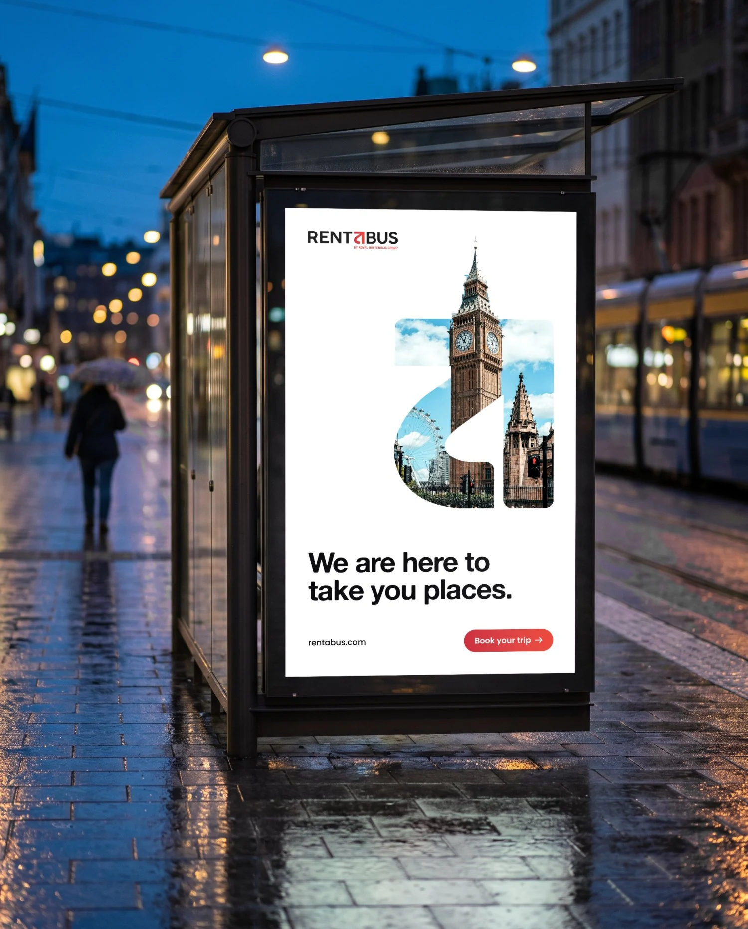
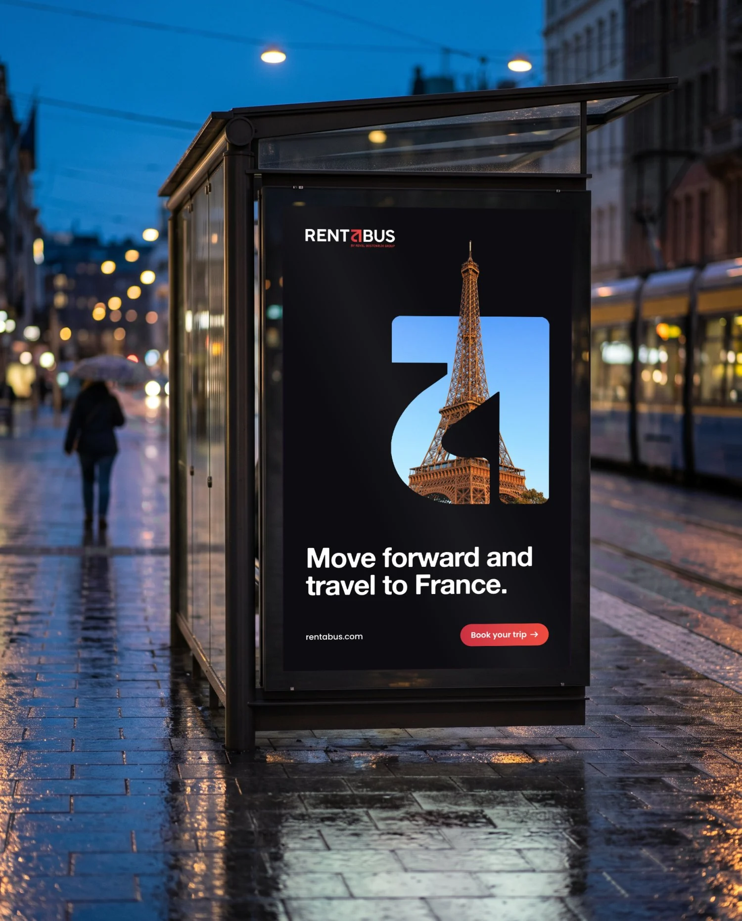
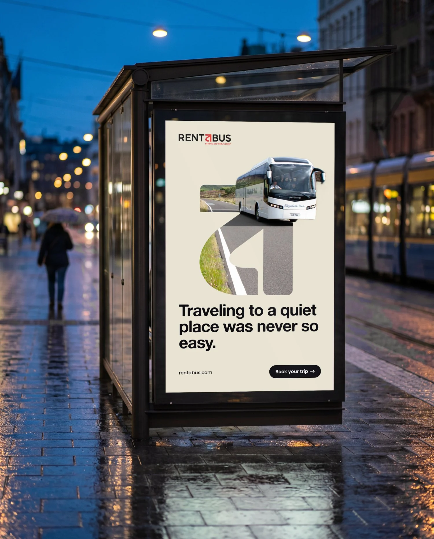
The mark also works without the name. Fill it with a photo and it becomes a window on a destination. That gives Rentabus one campaign format for every country it drives in.
One letter does three jobs
The a points at the letter next to it. Read the middle of the name and you get the whole service.
On its own it works like a compass needle: up and to the right, wherever the trip goes.
One colour change turns RENTABUS back into rent, a and bus. No spaces needed.
One kit, every destination
A logo, a mark that also works on its own, five colours and two typefaces. Few parts on purpose. The names and values below are the ones in the live stylesheet.
Logo



The mark



Colour
Type


Voice
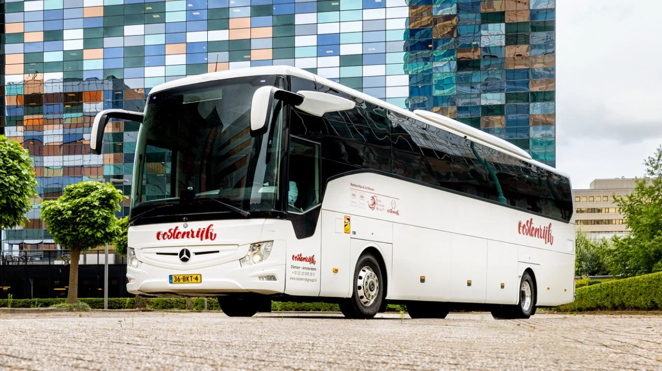

One short sentence about the trip, set in Alte Haas. The photo next to it shows where you are going.

The a is also a window
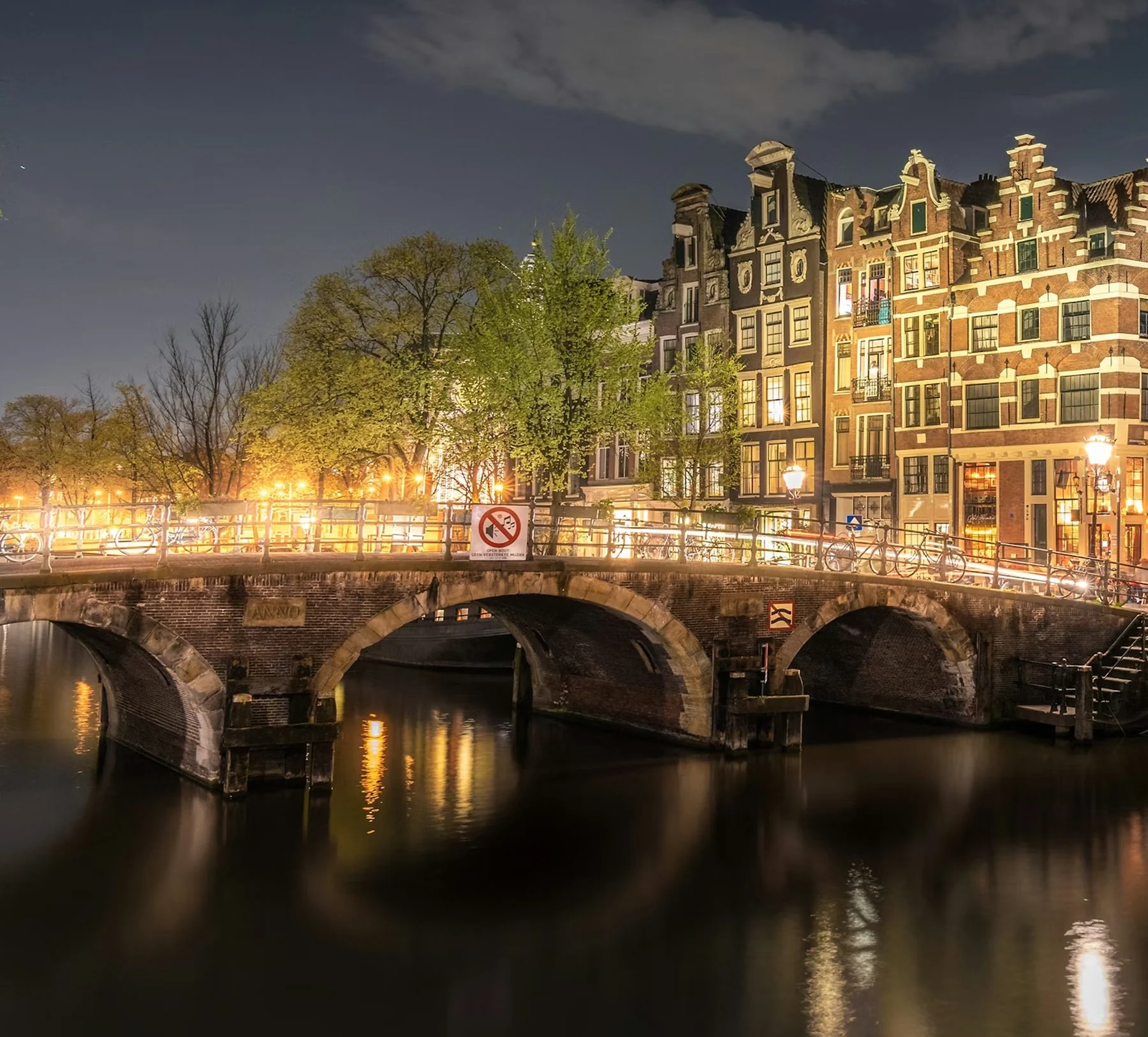
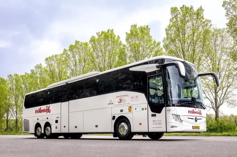
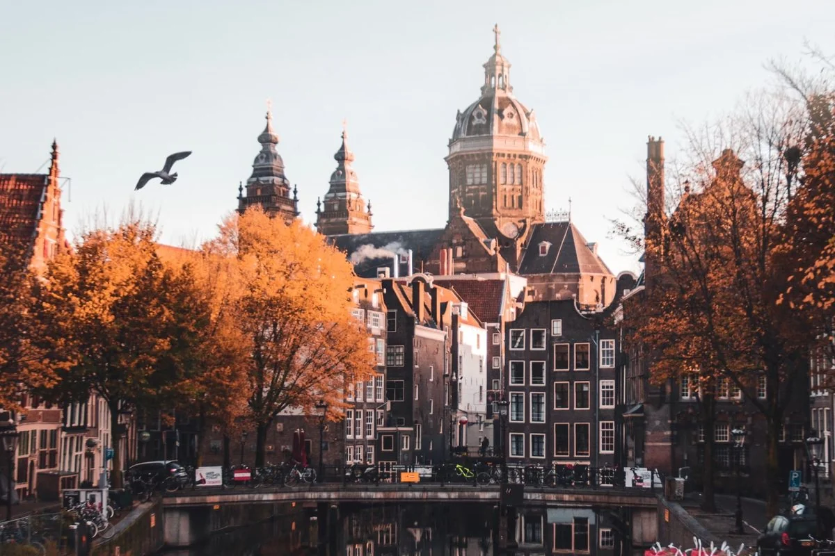
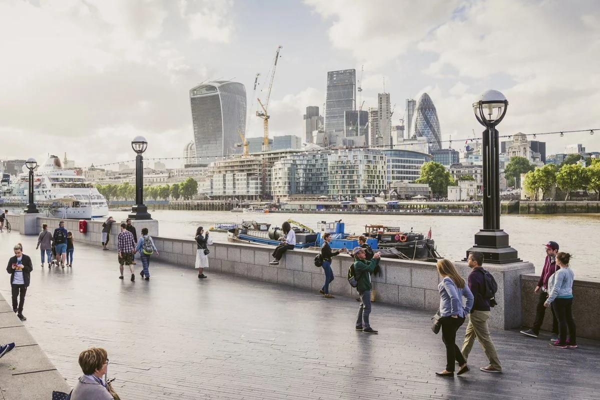
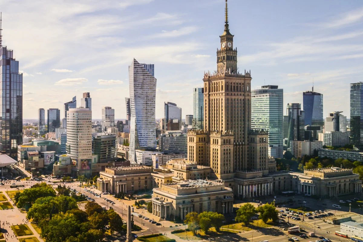
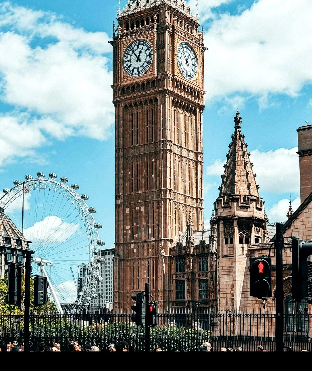
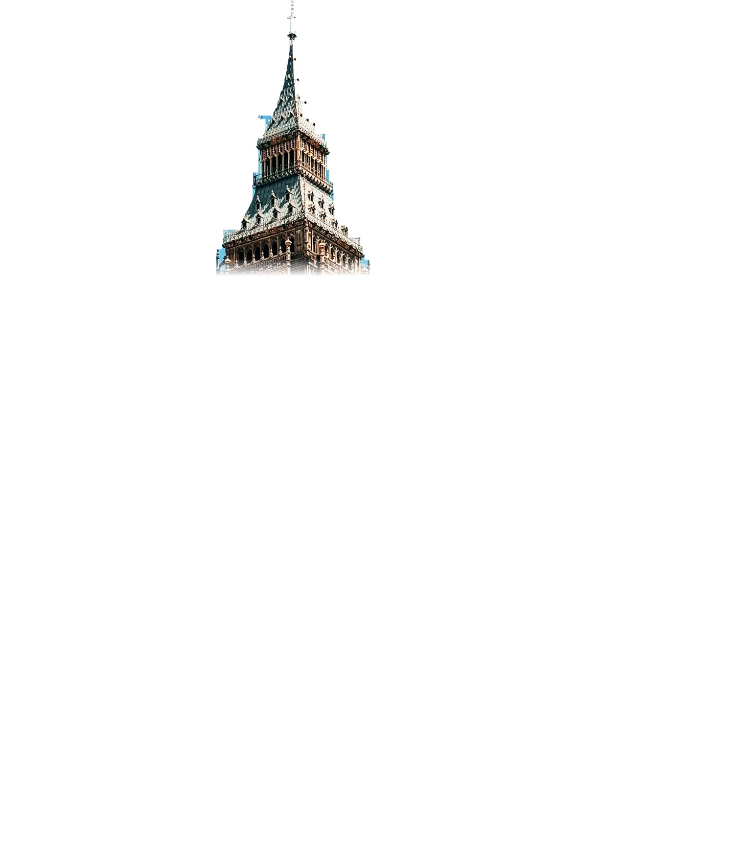
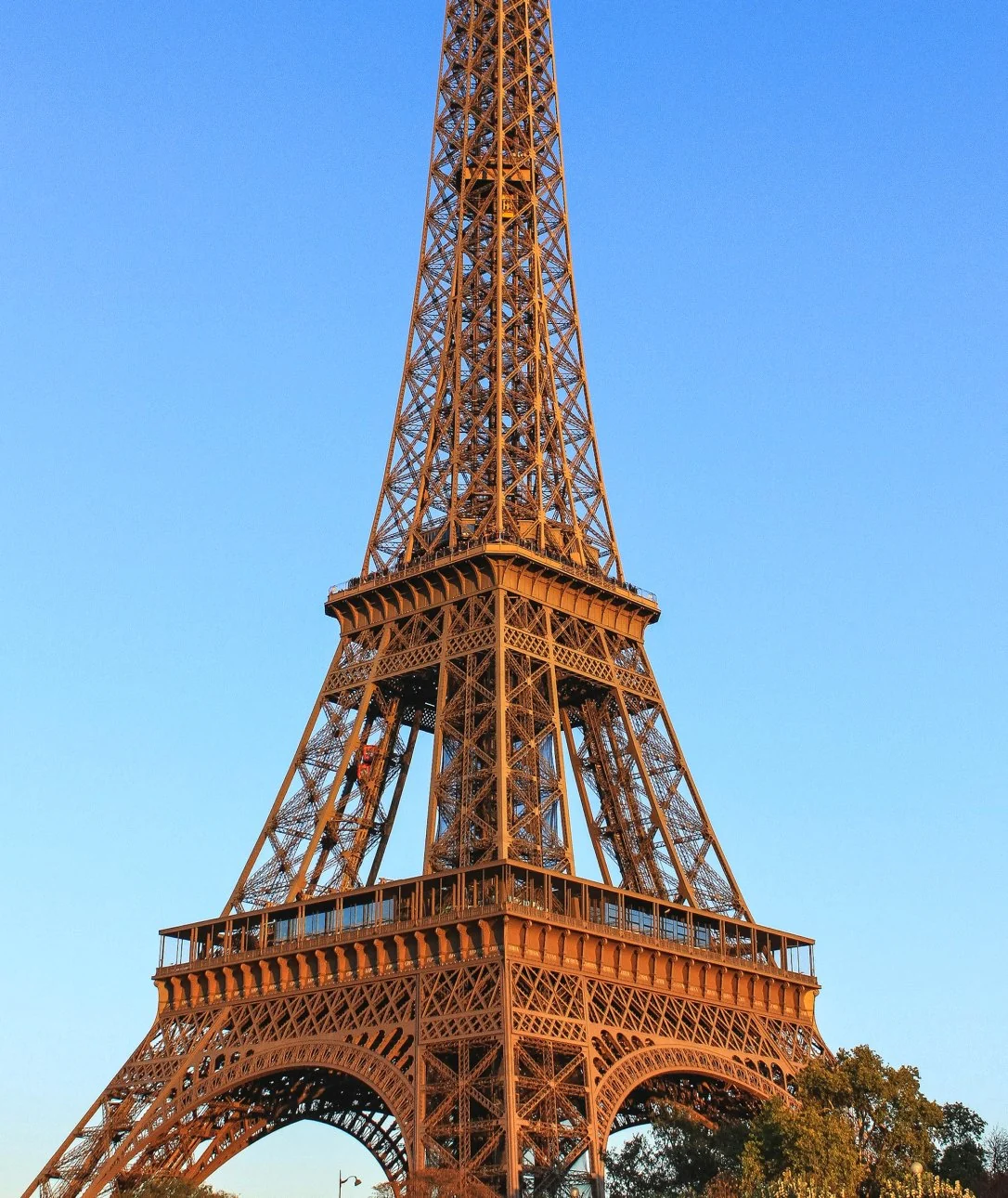
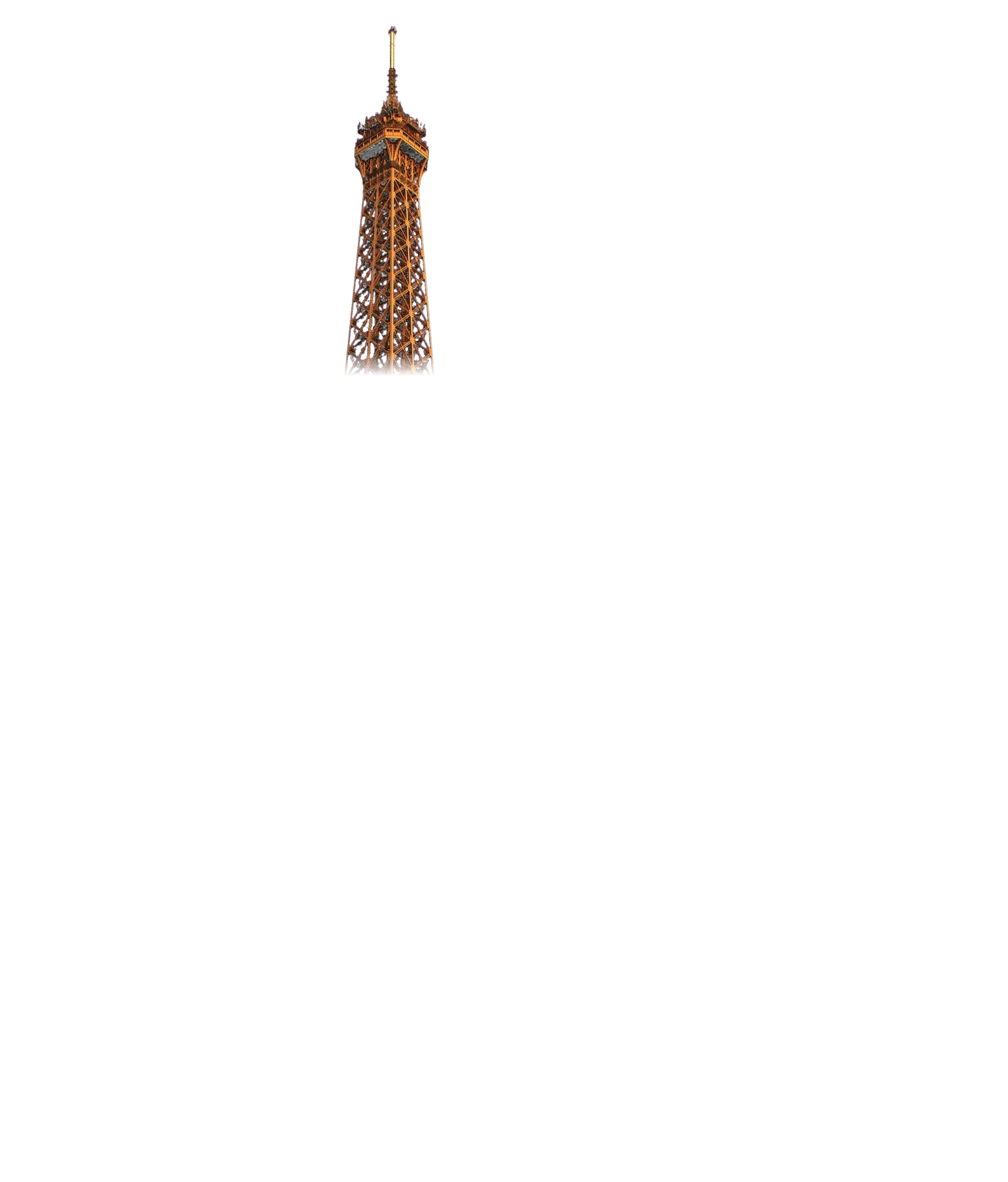
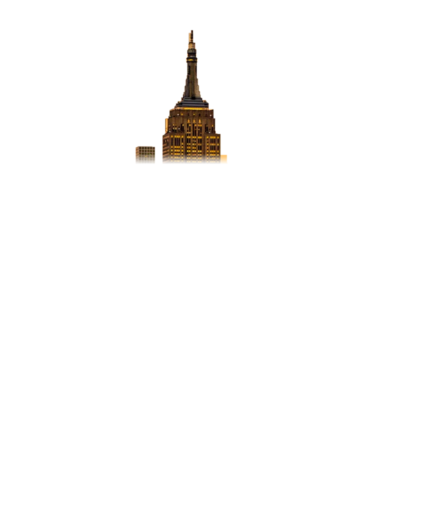
Fill the letter with a photo and it turns into a view of where you are going. Let the landmark break out of the top and the letter becomes the place itself. One format, and Rentabus has an image for every country it drives in.

From the kerb to the headrest
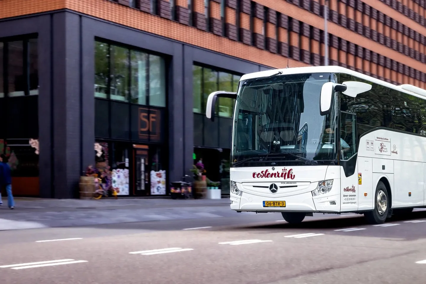
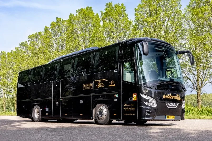
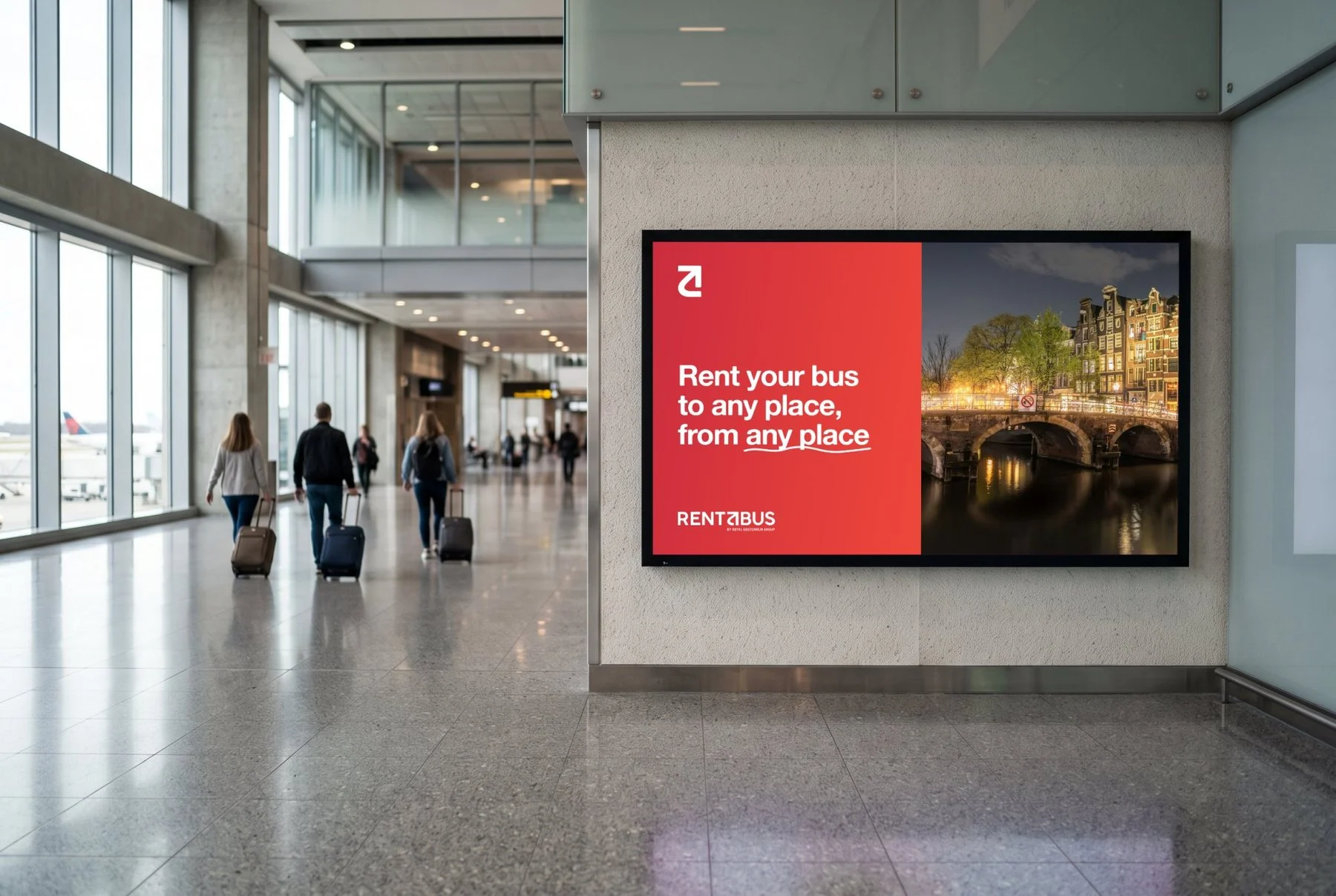
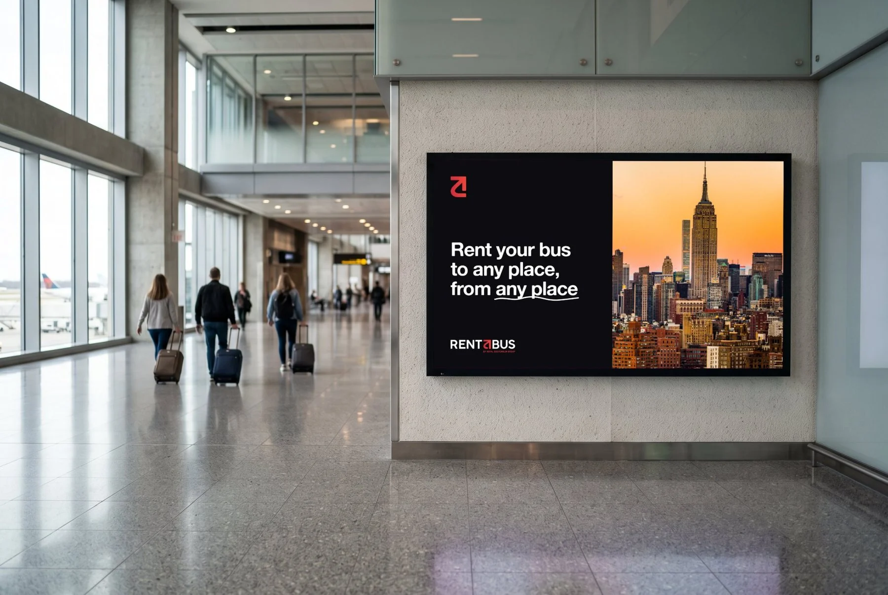
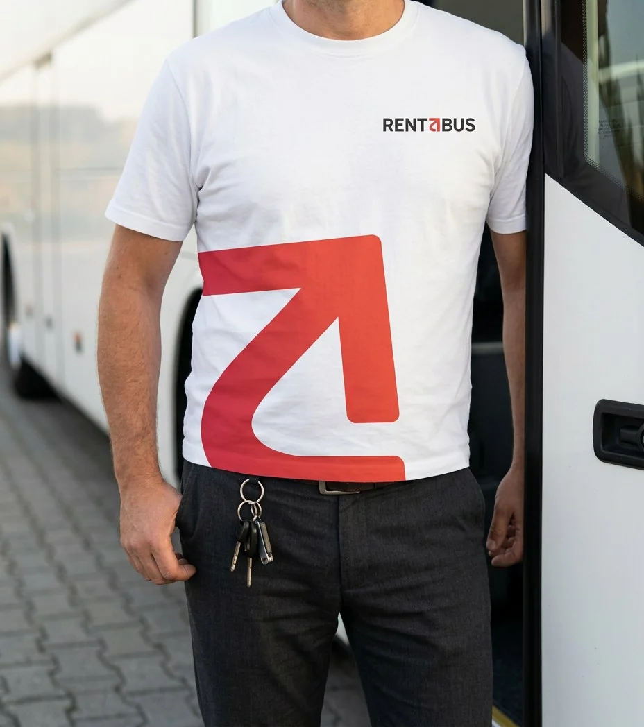
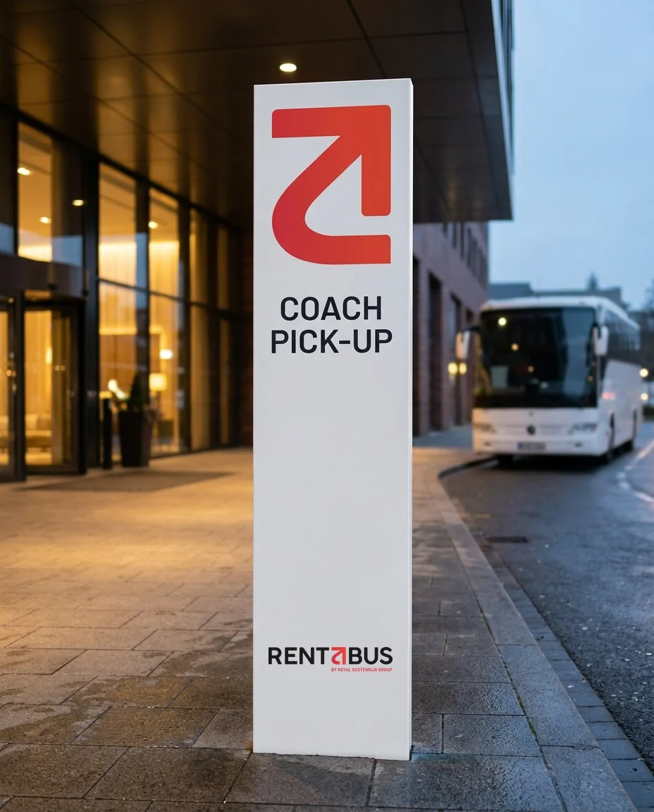
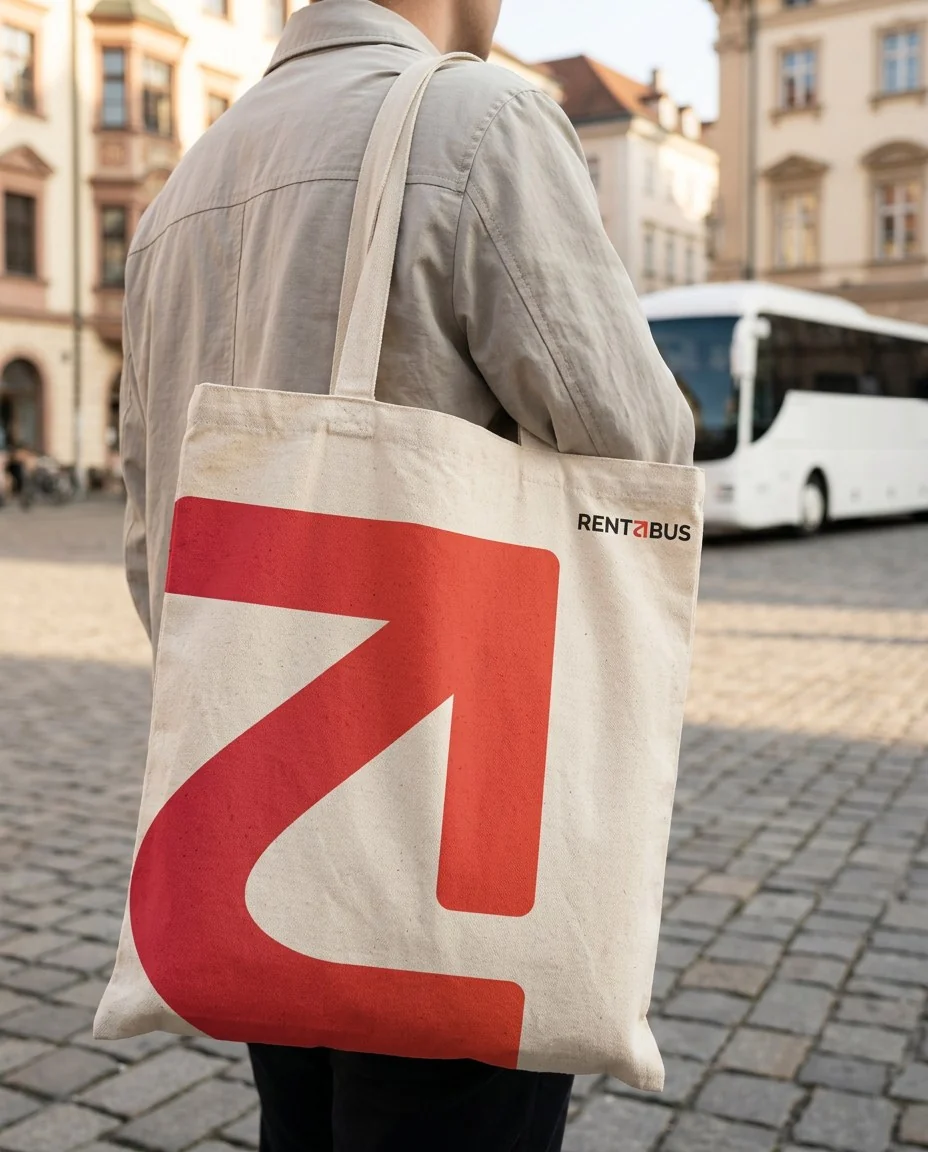
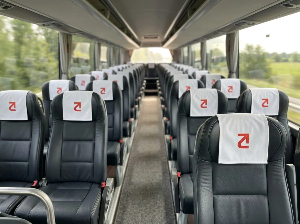
A coach company is seen from across the street and from thirty centimetres away. These concept mockups show the identity at both distances: the mark large and cropped where there is room, small and whole where there is not.
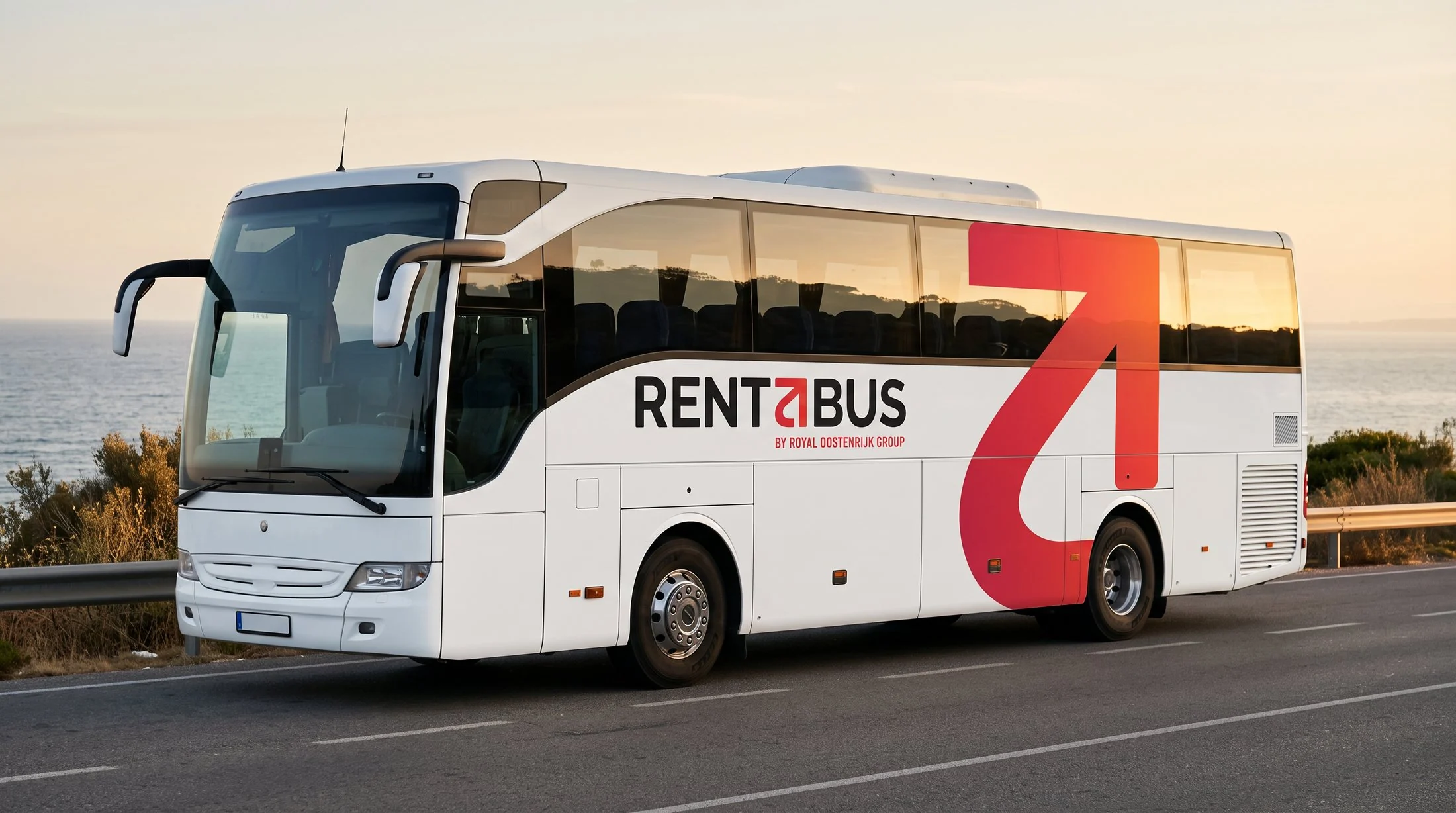
The brand, put to work
Every country gets its own stage
The country pages are where the brand moves most, in small things. This is the page for the Netherlands: links that underline, buttons that bounce, facilities that open when you tap them and a headline that keeps naming the next city.
Hover a link and it underlines, hover a button and it bounces. Tap a facility and it opens.
The popular cities sit in a row of narrow cards. One click and the next one opens to full width.
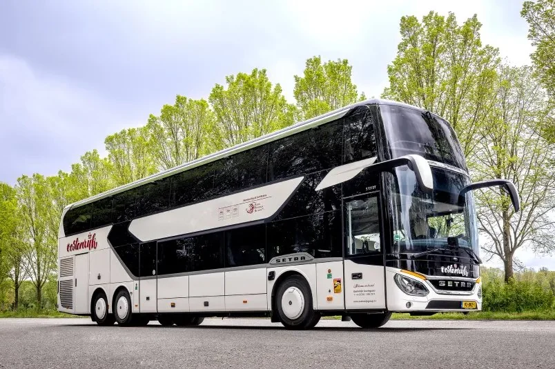
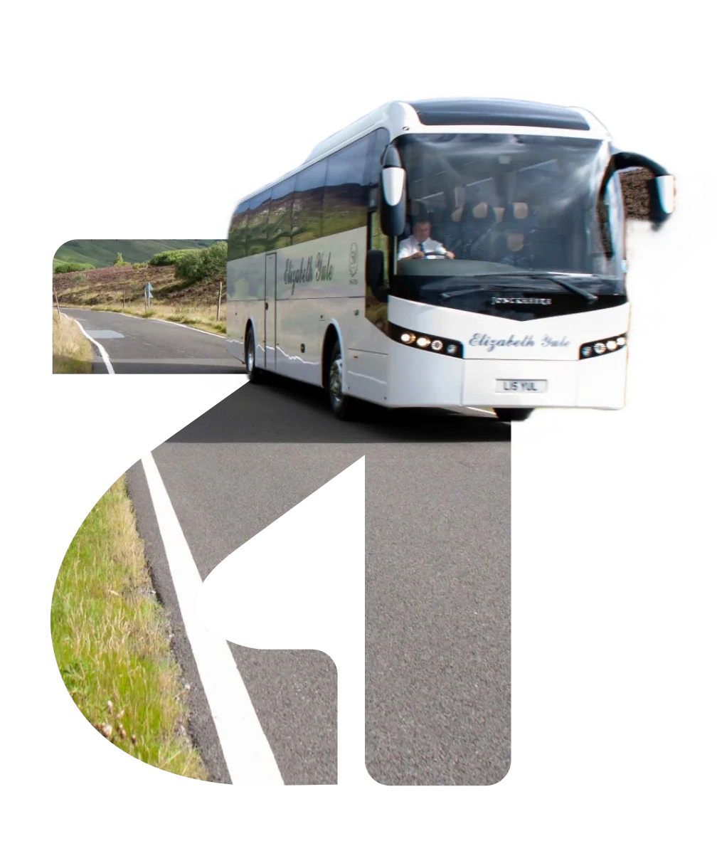
The a from the logo frames a stretch of road, with the coach in front of it.
What Rentabus walked away with
The name was already strong. Now the brand is too.
Rentabus did not need a new name or a clever symbol. It needed someone to take the name seriously and build everything around it: one letter, one gradient and a website that carries both.