Loading

September 4, 2026
August 31, 2025
July 31, 2025
June 26, 2025
June 16, 2025
June 8, 2025
May 31, 2025
May 1, 2025
February 6, 2025
November 14, 2024
October 10, 2024
October 1, 2024
nrds logo
nrds

A website as warm and direct as nrds itself

nrds doesn't do cold calling. They build new relationships. Their previous brand told a different story. We rebuilt it from the ground up: a digital home that finally matches the warmth, confidence, and character behind the nrd-way.
Services
Art Direction
Figma Design
Photography
Webflow Development
SEO
Client
nrds
Industry
Inside Sales
Year
December '2025

International Passenger Transport -

Doing it the nrd-way

nrds stands for New Relationship Development Specialists, and every word in that name matters. They approach outreach differently: no pressure, no scripts, no pushy tactics. Just intelligent, respectful conversations that open doors. Their old brand didn't reflect any of that. So, it was time for a completely new brand.

Our approach

Where character meets craft

Learn more about our approach

Owner | Strategy
Nick Bazuin

Challenge

nrds had built something genuinely different over 15 years: a cold calling philosophy rooted in respect, substance, and real human connection. Their methodology, the nrd-way, is thoughtful, well-documented, and unlike anything else in the industry.

But their website didn't know that. It looked and felt like a standard B2B sales agency: polished in the wrong way, heavy on stock imagery, light on personality. For a company that prides itself on being direct and authentic, with the Rotterdam mentality to back it up, the disconnect was jarring. Especially for potential clients doing their due diligence before deciding to pick up the phone.

Solution

The website was the starting point, and the most important one. We stripped away everything that felt generic. New photography of real people, real offices and real energy replaced the stock library entirely. The copy was rewritten to carry the same confident-but-human tone that nrds brings to every conversation: no corporate gloss, no hollow claims.

As the website took shape, it became clear the visual identity needed to move with it. The existing logo mark was refined: the speech bubble icon, already at the heart of the brand concept, was sharpened and made more intentional. The name shifted to all lowercase (nrds), a deliberate choice that reflects their philosophy. We don't shout. We don't need to. The work speaks.

From there, the identity rolled out consistently across every touchpoint: email signatures, letterhead, and a complete social media banner set, all built to feel like one coherent brand, not a collection of assets.

Result

The new nrds.partners communicates what nrds actually is: a company with a distinct philosophy, a 15-year track record, and the confidence to show up differently in a sector defined by volume and noise. Visitors now land on a site that opens a conversation rather than listing a service menu.

The visual identity, from the speech bubble icon to the lowercase name, reinforces the same message on every touchpoint. The brand no longer whispers what makes nrds different. It shows it.

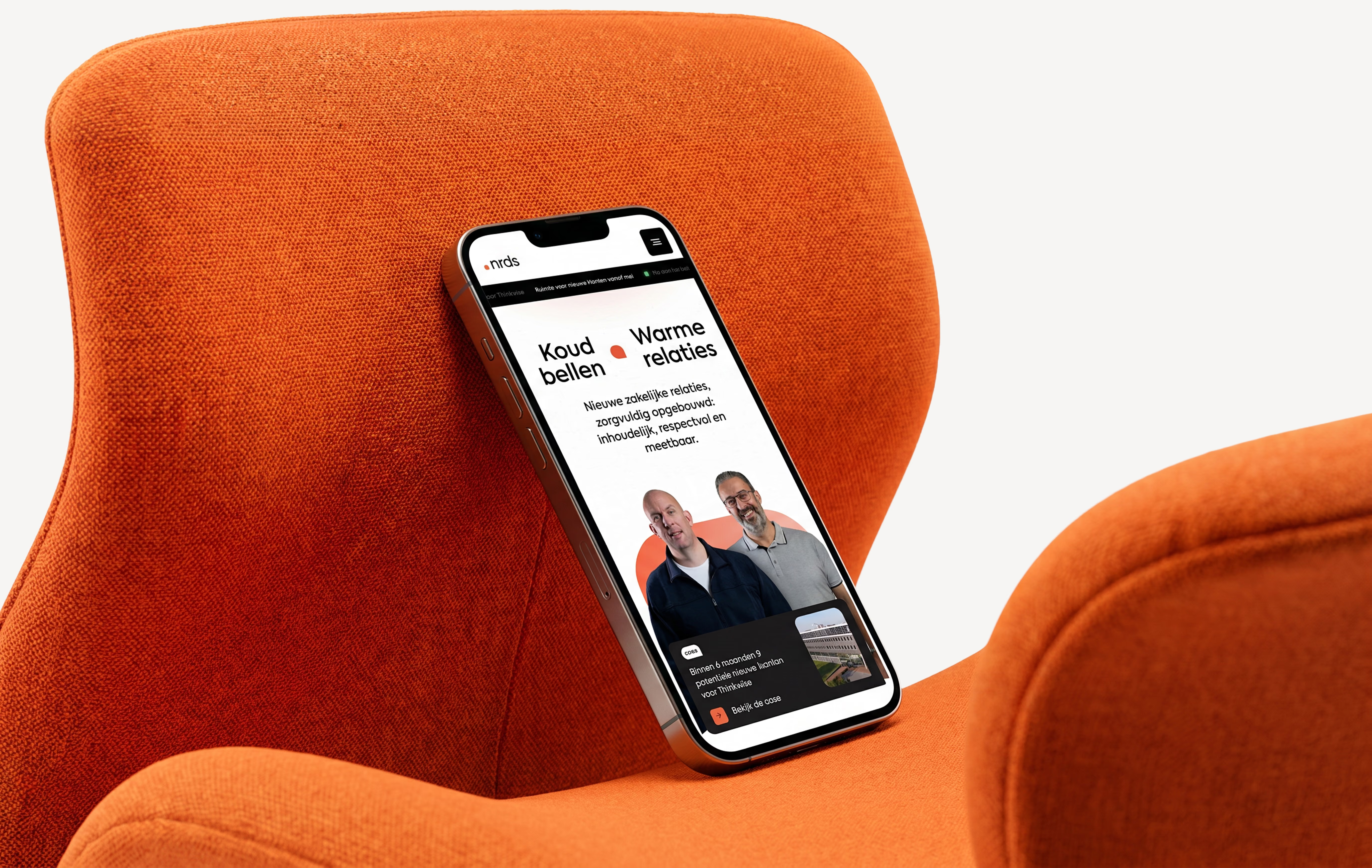
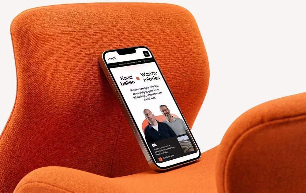
Smartphone resting on an orange chair showing a website with two men and Dutch text about business relations.
Branding

A refined mark with a clearer message

The speech bubble was already the direction, we sharpened it. The icon became more intentional, the name shifted to all lowercase (nrds), and suddenly everything clicked. Not a reinvention, but a refinement that made the brand unmistakable. Confidence doesn't need capital letters.
The nrds wordmark with its orange dot on a black background
Building

One identity. Every touchpoint.

From email signatures to LinkedIn banners to letterhead, the nrds identity system was built to travel. Every asset reinforces the same message: approachable, credible, and unmistakably nrds. Because consistency is what turns a brand into a reputation.

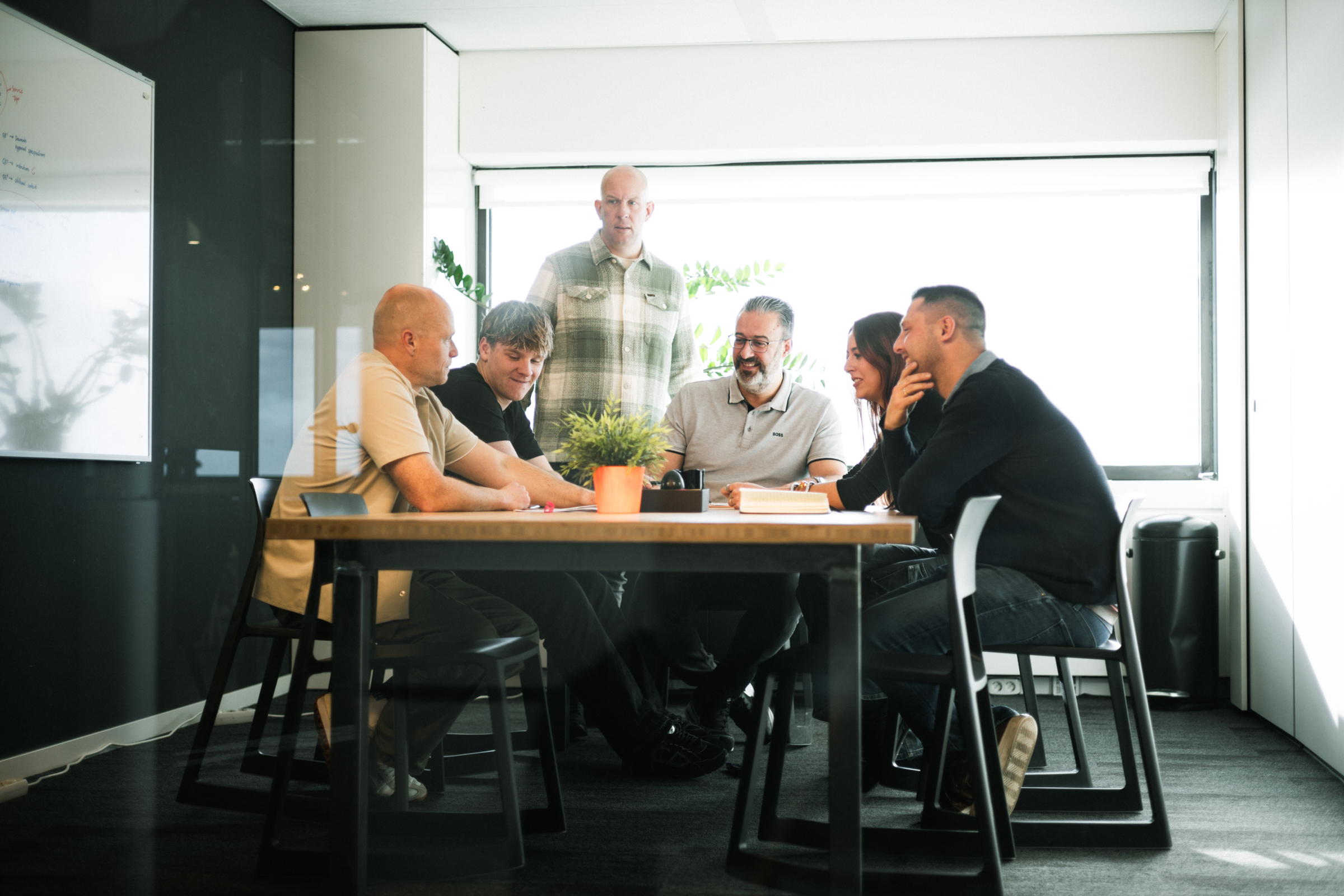
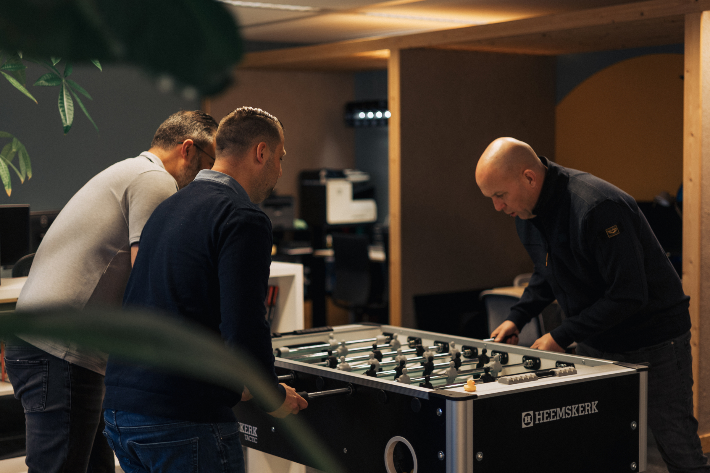
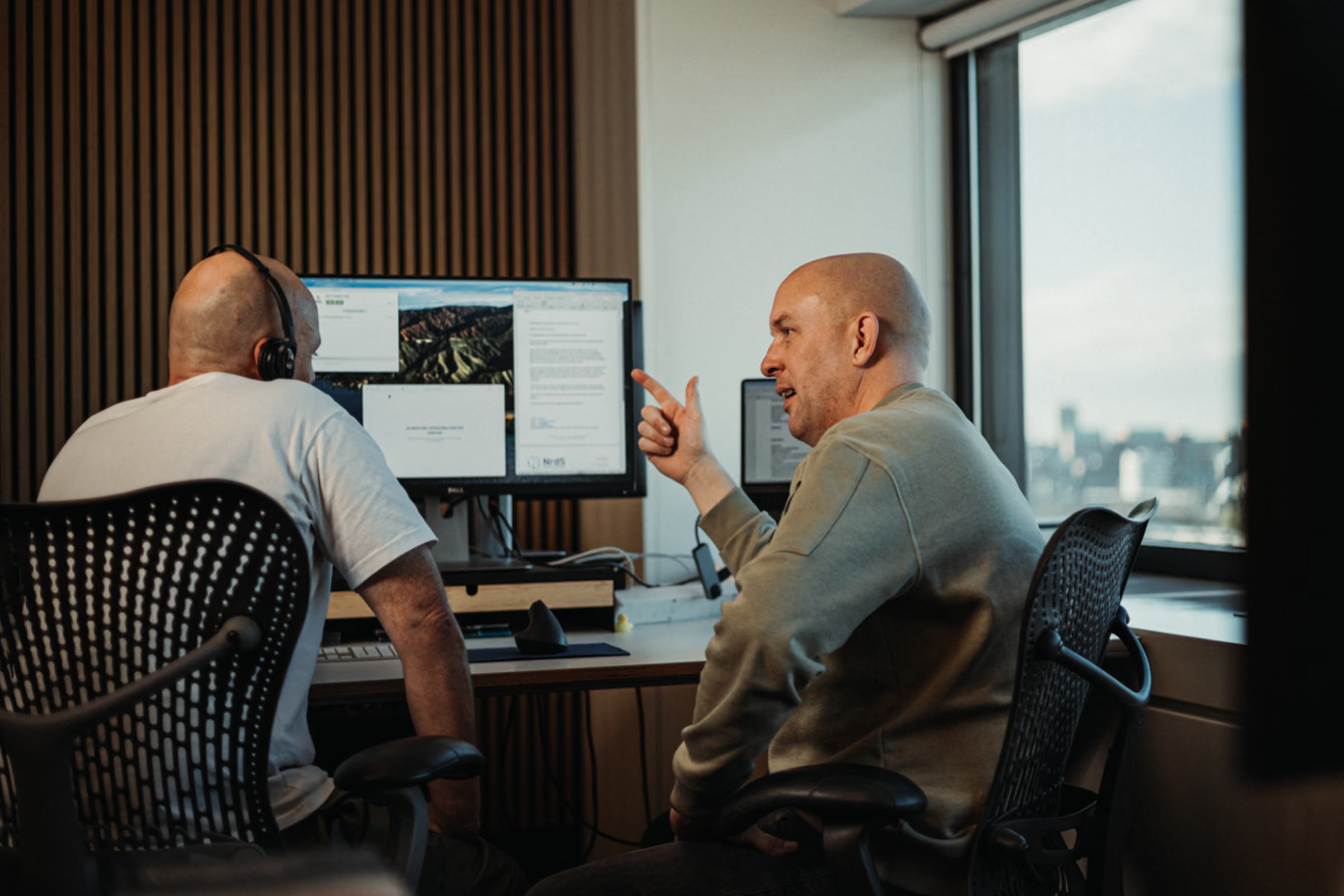
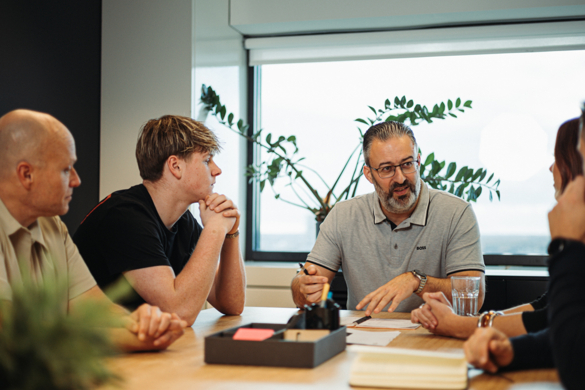
Brand new photography
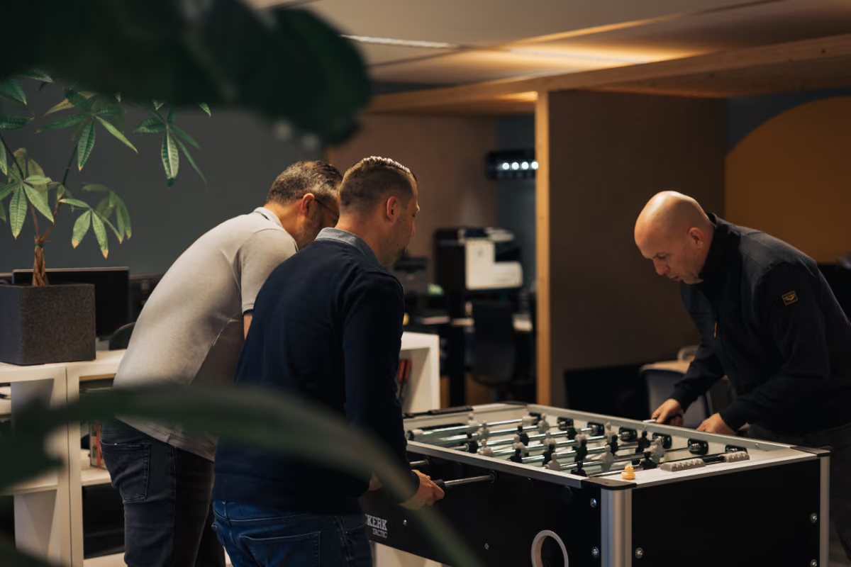
Colleagues playing table football in an office, photographed by Digitalmakers

We replaced the entire image library with photography made for this brand: real team members, real workspace, real culture. The result is a site that doesn't just tell you nrds is different. You see it in the first three seconds.

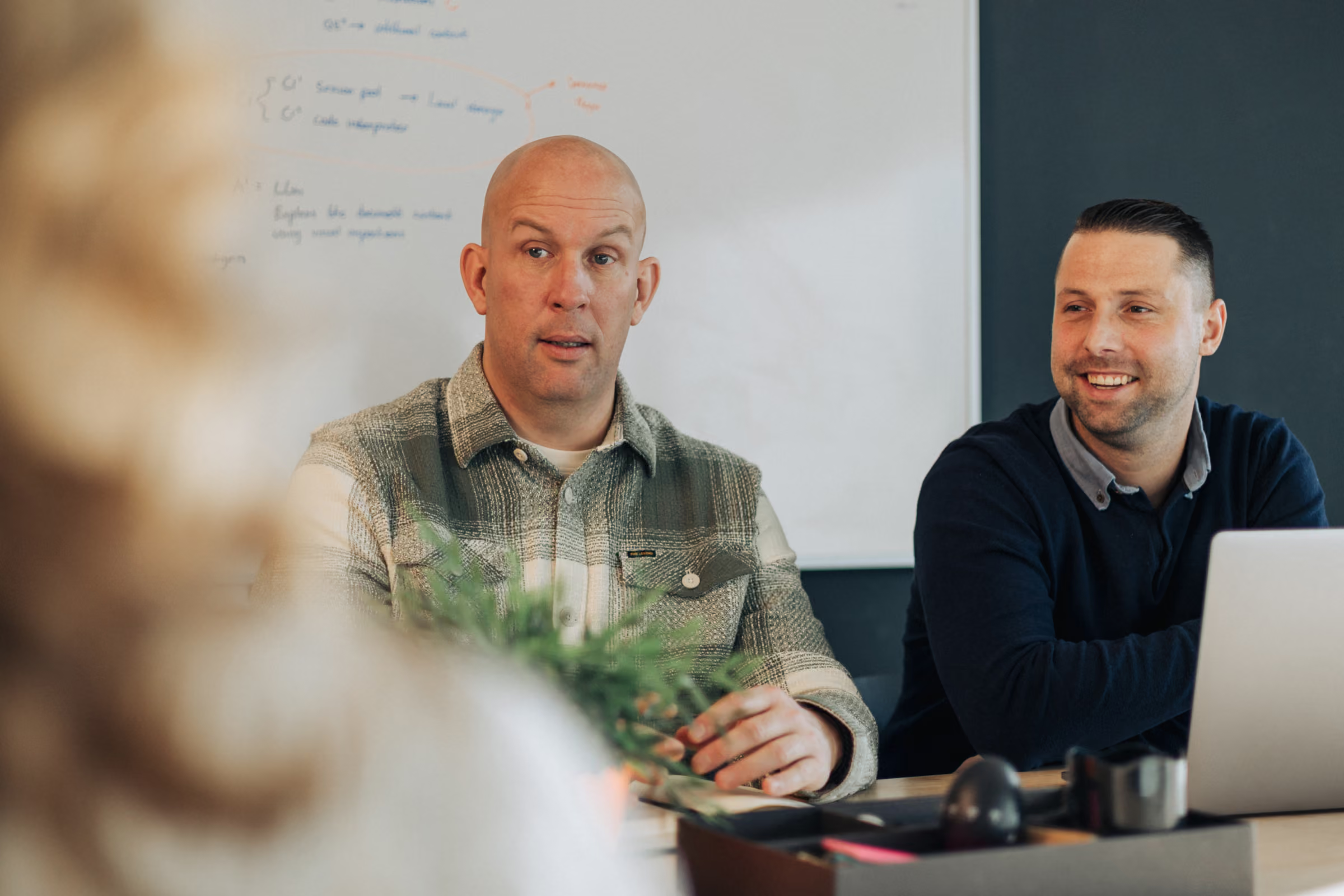
Two men sitting at a table in a meeting room with a whiteboard in the background.
Six people having a meeting around a table in a bright office with a whiteboard and window.
Three men playing foosball on a Heemskerk table in a cozy indoor space.
Two men talking at a desk in an office, one pointing at a computer screen with multiple windows open.
A man in glasses leads a meeting with three attentive colleagues around a conference table.
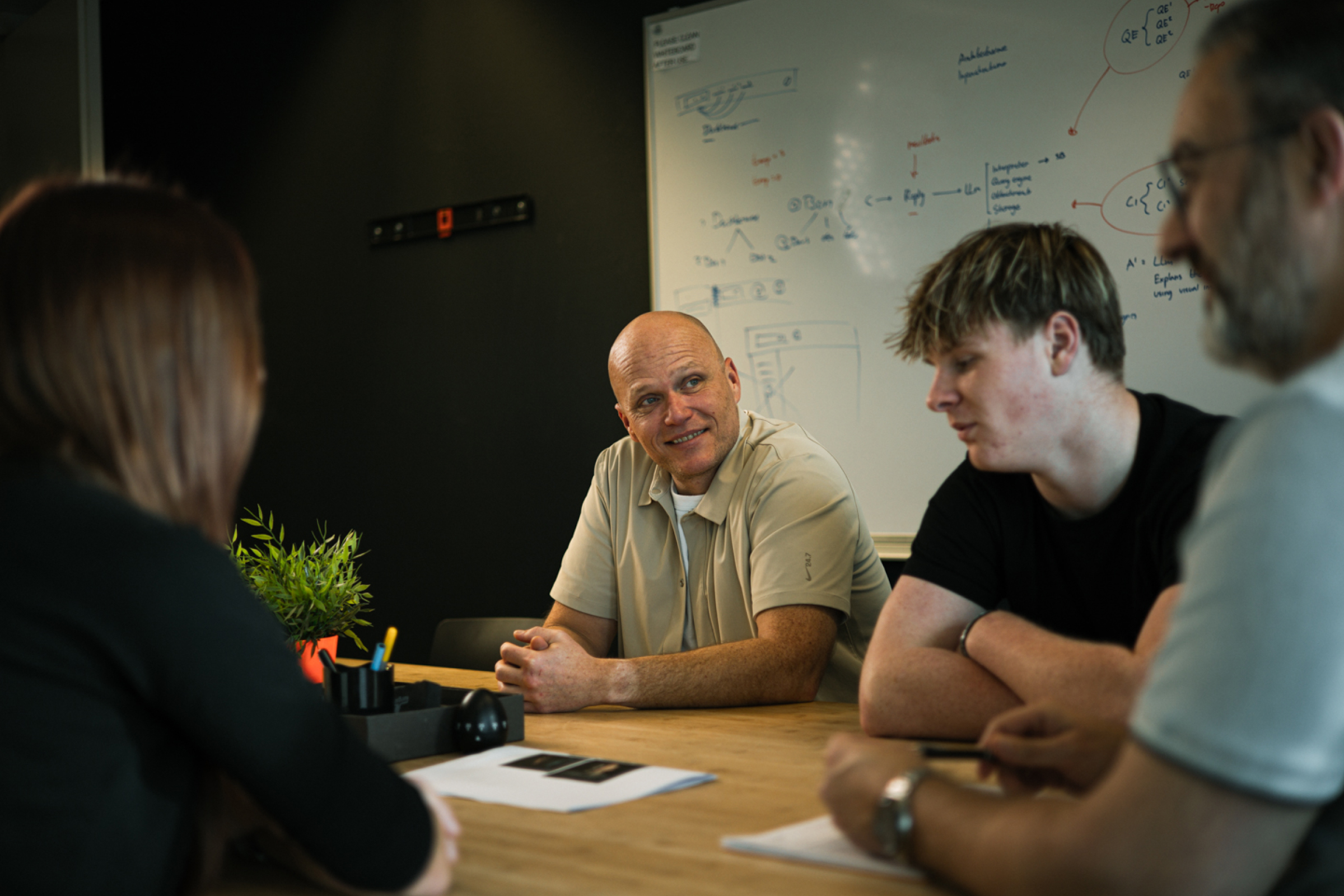
Four people in a meeting room with a whiteboard covered in handwritten notes behind them.

A new experience

Build in Webflow
nrds has spent 15 years perfecting the art of the first conversation. The website now does the same. Every section is built to move the right visitor closer to a conversation, without pressure, without noise, and without anything that feels like a script.
Building

Build completely in Webflow

The NRDS website is fully built in Webflow, giving the team complete control over content without touching a line of code. Every section is structured for clarity and conversion, from the homepage hero to the case study layout, without sacrificing the warmth that makes the brand stand out in a crowded market.
Young man with a bun hairstyle, wearing a jacket and smiling while looking to the side.

Robin Busch

Owner | Art Director & Developer
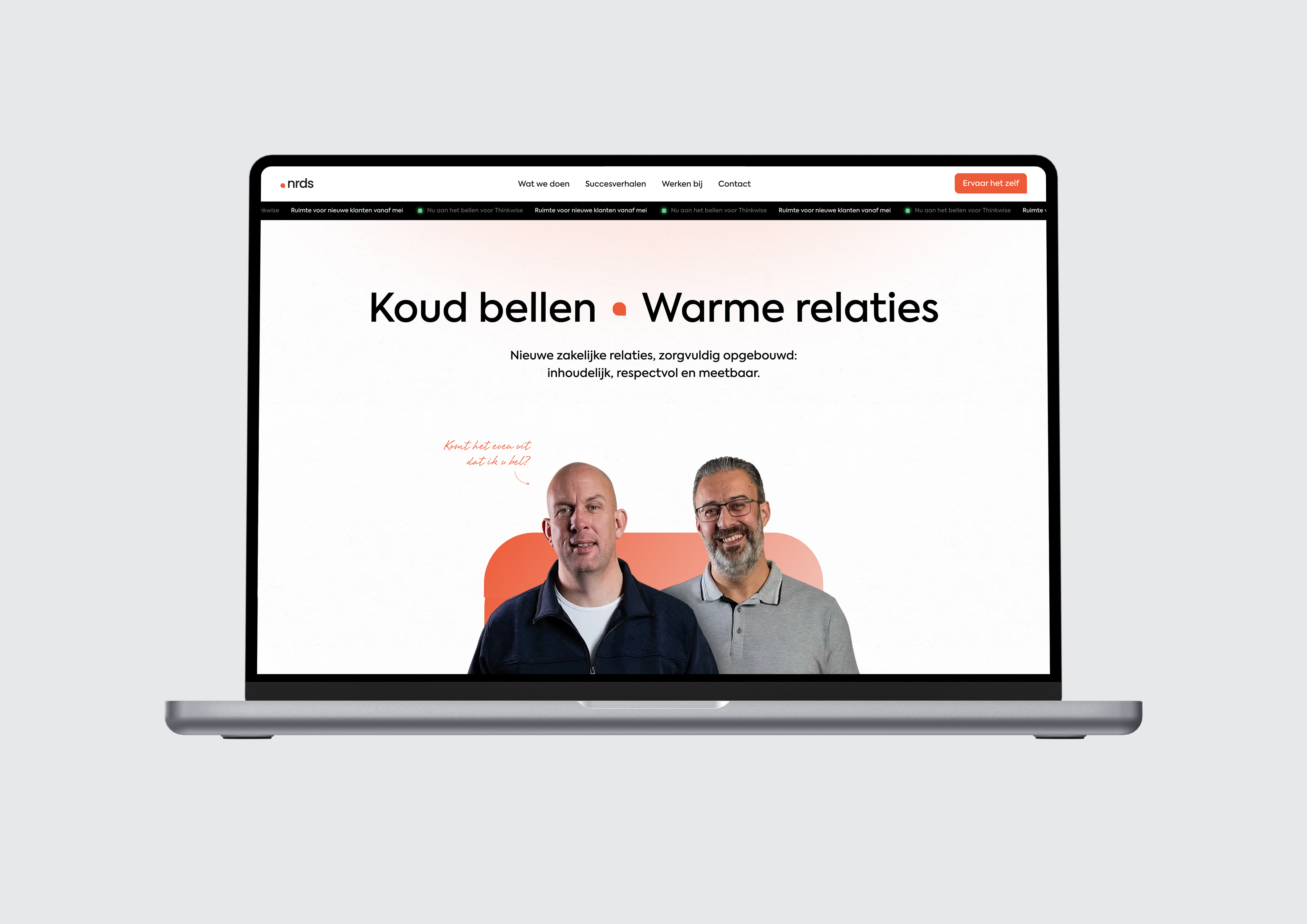
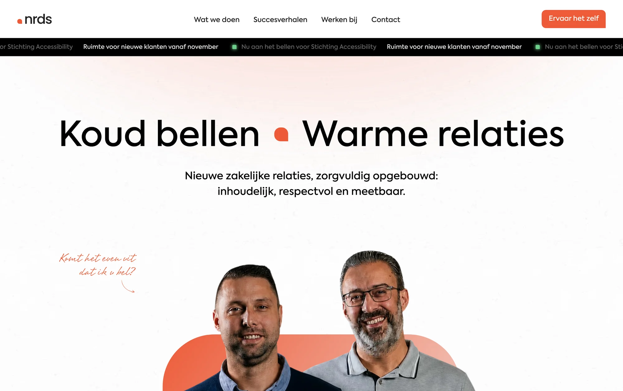
Website displayed on laptop with two men and Dutch text about building respectful business relationships.
Gray abstract blurred background with a subtle gradient and patterns.

Other cases

Last added 1 week ago